How To Create A Bar Graph In Excel With Percentages

Looking to visualize your data with percentages effectively? Bar graphs are a great way to compare categorical data, and Excel makes it easy to create them. In this guide, we’ll walk you through the steps to create a bar graph in Excel, including how to display percentages on your chart.
Make a Bar Graph with Percentages in Excel
Time needed: 3 minutes
Here’s a step-by-step guide to make bar graph with percentages in Excel spreadsheet
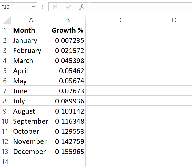
- Prepare Your Data
Ensure your data is organized in a clear table format. You should have two columns: one for categories (e.g., product names, regions) and one for corresponding values. If you don’t have percentages directly, calculate them by dividing each value by the total and multiplying by 100.
- Create the Bar Graph
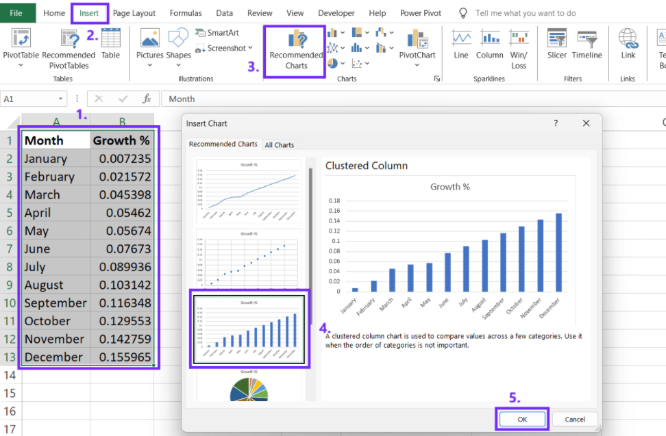
Click and drag to select the range of cells containing your data (both categories and values).
Go to the “Insert” tab. In the “Charts” group, click on the “Column Chart” icon. Choose the “Clustered Column” or “Stacked Column” chart type. - Add data labels to a chart
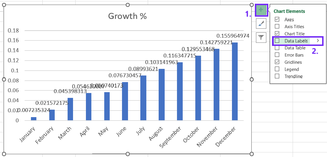
To add precentages, first you need to add data labels. Right-click on one of the bars in your chart. Select “Add Data Labels.” This will add labels to each bar, displaying the corresponding value.
- Format chart data as percentage
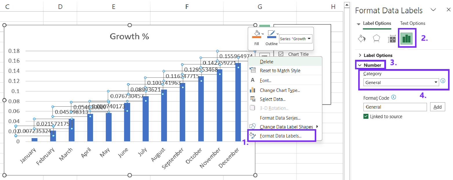
Now that you have data labels you can format data as percentage. Right-click on one of the data labels. Select “Format Data Labels.” In the “Number” tab, choose “Percentage” as the number format.
- Customize chart
You can further edit your chart to meet your needs. Add a clear and concise title to your chart. Label both the x-axis (categories) and y-axis (percentages). Use Excel’s built-in chart styles to change the appearance of your chart. Customize the colors of your bars to enhance visual appeal and clarity.
How To Make Bar Chart With AI
Bar charts are a classic tool for comparing categorical data, and with AI, creating them has become easier than ever.
#1 Prepare Your Data
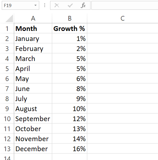
- Collect the data you want to visualize. This could be sales figures, survey results, or any other categorical data.
- Organize your data into a clear table format. You’ll typically have two columns: one for categories and one for corresponding values.
- Save your data as a CSV (Comma-Separated Values) file. This format is widely accepted by AI tools and makes it easy to upload your data.
#2 Choose an AI Tool
There are several AI tools that can help you create bar charts. In this guide we will use online bar graph maker that you can also use for free.

#3 Upload Your Data
To get your data visualized you need to upload CSV file. You can easily export you Excel file as Comma-separated values (.csv) file. To do that, click File and Saves as, select file type as CSV.

#4 Write Your Prompt

- Clearly state your desired output. For example, “Create a bar chart with percentage growth by month”
- Specify the chart type (bar chart), data source (uploaded CSV file).
- Once the prompt is ready, click Generate
#6. Download the Chart
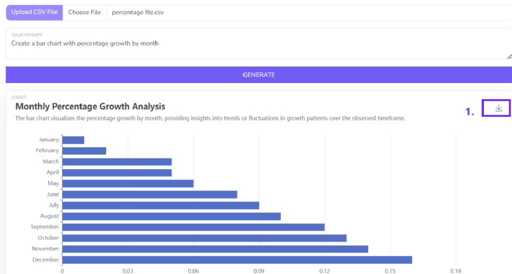
- Once you have generate the chart download it as a picture. You can then use the downloaded chart in presentations, reports, or on your website.
FAQ
To calculate percentages, divide each value by the total sum of all values and multiply by 100.
Right-click on one of the bars in your chart. Select “Add Data Labels.” Right-click on a data label and select “Format Data Labels.” In the “Number” tab, choose “Percentage” as the number format.
